For each presentation, you can view reports showing viewing statistics. In the presentation's Dashboard report, you will find performance data (views, peak connections, etc.), viewing trends, top users, and platforms used to view the presentation.
You can also download data in the Dashboard report to an XML file formatted for Excel and view real-time statistics in the Who's Watching report.
Presentation Dashboard Report
- Access the MyMediasite Portal.
- Choose the appropriate presentation. The Information page opens.
Click View Analytics.
Image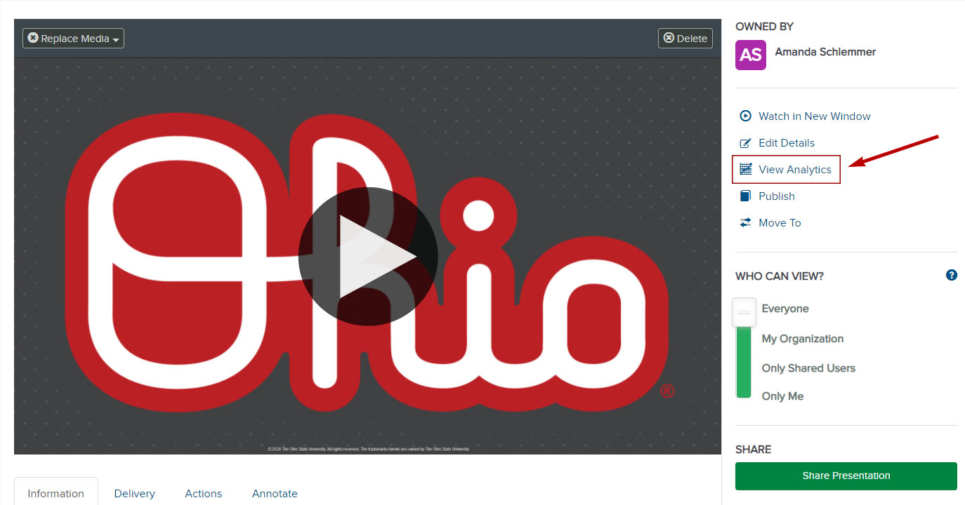
The Dashboard tab will open. There are four main reporting areas that are described in the next section: Performance, Trends, Top Users / IP Address and Platforms.
Image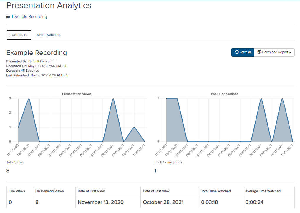
Reporting Areas
Performance
Performance consists of 8 subsections:
- Total Views - The total number of times the presentation was watched (includes live and on-demand views).
- Peak Connections - The highest number of concurrent views for the presentation.
Live - The number of times the presentation was watched live.
- On Demand - The number of times the recorded presentation was watched.
- Date of First View - Shows date the presentation was first viewed.
- Date of Last View - Shows date the presentation was last viewed.
- Total Time Watched - The total amount of time (h:mm:ss) user spent watching the presentation.
- Average Time Watched - The average amount of time (h:mm:ss) users spent watching.
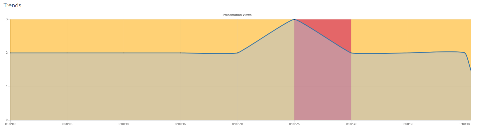
Trends
Trends show an intensity graph that highlights which parts of presentations were viewed most. Views less than 60 seconds in duration are not displayed in the graph and grid.
Warm colors indicate a dense number of watches while cooler colors represent less density, indicating that viewers tended to stop watching.
Users / IP Address
Users / IP Address consists of 5 subsections:
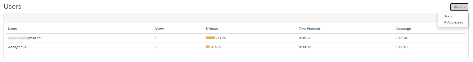
- Users - Username used to view a presentation.
IP Address - IP address of the computer used to view the presentation.
- Views - Number of views by each user.
- Time Watched - Time the user spent watching.
- Coverage - The amount of presentation watched by the user. Example: A user opens a presentation and watches the first 30 minutes of a presentation, pauses the video, seeks back to the start and watches for 40 minutes. The coverage for this user is 40 minutes. i.e. the user spent a total of 70 minutes watching the presentation (total time watched), but in that time the user only covered the first 40 minutes of the presentation.
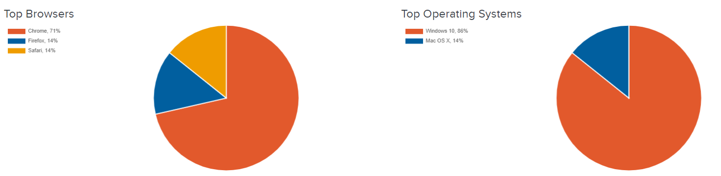
Platforms
Platforms show graphical data showing the top web browsers and operating systems used to view the presentation.